Academic Studio Project - 2023
US Energy Map
The US Energy Map makes the grid visible, compelling, and understandable.

Early into my senior semester, I learned about a number of vertical farms in Europe that had recently gone out of business. The Russo - Ukrainian Conflict and the subsequent shift from Russian supplied energy had lead to a dramatic increase in energy costs, which these vertical farms could not absorb.
When the gas was shut off, as it were, there were second order effects that rippled out in all directions.
This example illustrates that without an energy system, we have no food system. I felt compelled by the idea that something as seemingly simple as energy could so easily disrupt human life. I therefore centered my focus to researching energy, and how fragile our world becomes when it faces disruption.
The grid is much more than power lines. It can be helpful to think of it as comprising four sub-systems: Extraction, Production, Distribution, and Consumption.


Extraction
80% Of domestic energy production relies on fossil fuels like oil, coal, & natural gas, extracted through wells and mines. Though renewable energy production is not reliant on the fossil fuels, it’s production significantly relies on the earth’s mineral resources- vast amounts of copper, silicon, and rare earth metals. The extraction and processing of these materials has environmental and human impacts at a global scale.
Production
Currently, energy production largely involves converting organic matter into electricity through combustion, steam, and turbines. While effcient in converting fuel to electricity, this thermal method of energy production comes with significant environmental costs. Renewable energy sources harness natural processes to generate electricity, but are not without their own unique challenges.
Distribution
The US energy distribution network is notably fragile and complex. It is not governed by a single entity; rather, it is managed by a myriad of private and public firms. Remarkably, the failure of just 10 key US power substations could trigger a catastrophic collapse of the grid throughout the country.
Consumption
Energy consumption remains curiously opaque to end-users. Before we can engage in meaningful conversation about decarbonization, it has become clear to me that the complexity of these systems make it diffcult for people to comprehend the impact of our energy use. This project aims to bring clarity to these enormous and critical systems, wrangling complexity into a legible medium.
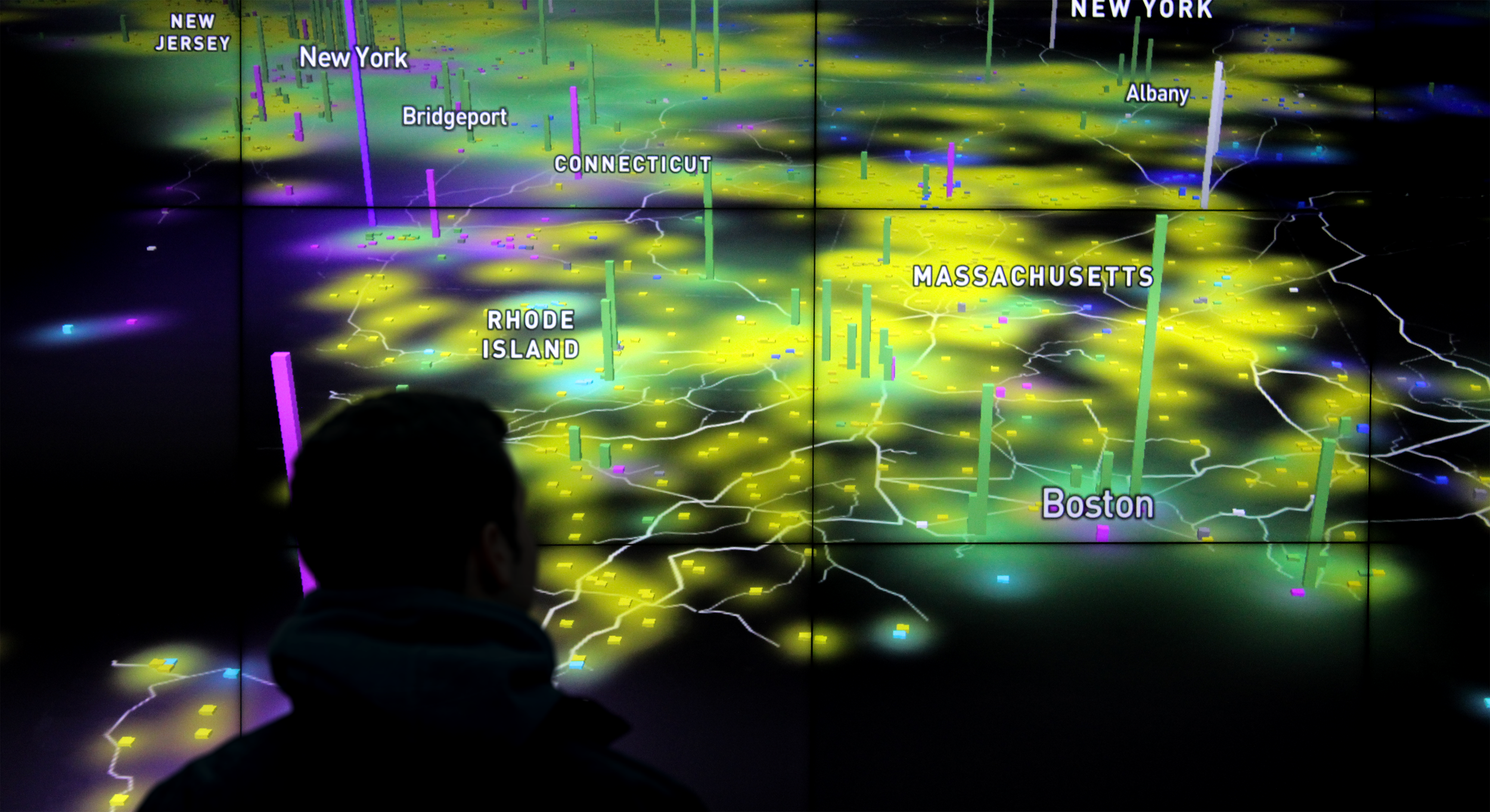
The US Energy Map is the designed outcome of my research on the domestic energy system.
Once I had obtained a better understanding of this system for myself, I set out to build tools that would help others come to share this understanding, specifically within the scope of the United States.
The result is a digital tool that helps users understand the sheer scale and magnitude of the grid, while illustrating their position within it.
I sourced the data that powers the application from the US Energy Information Administration. I was conscious while building this tool of the inherent subjectivity of data visualization. Designers and developers choose which data to omit, emphasize, and minimize. With that in mind, I aimed to represent this data in the most unbiased and objective manner possible.
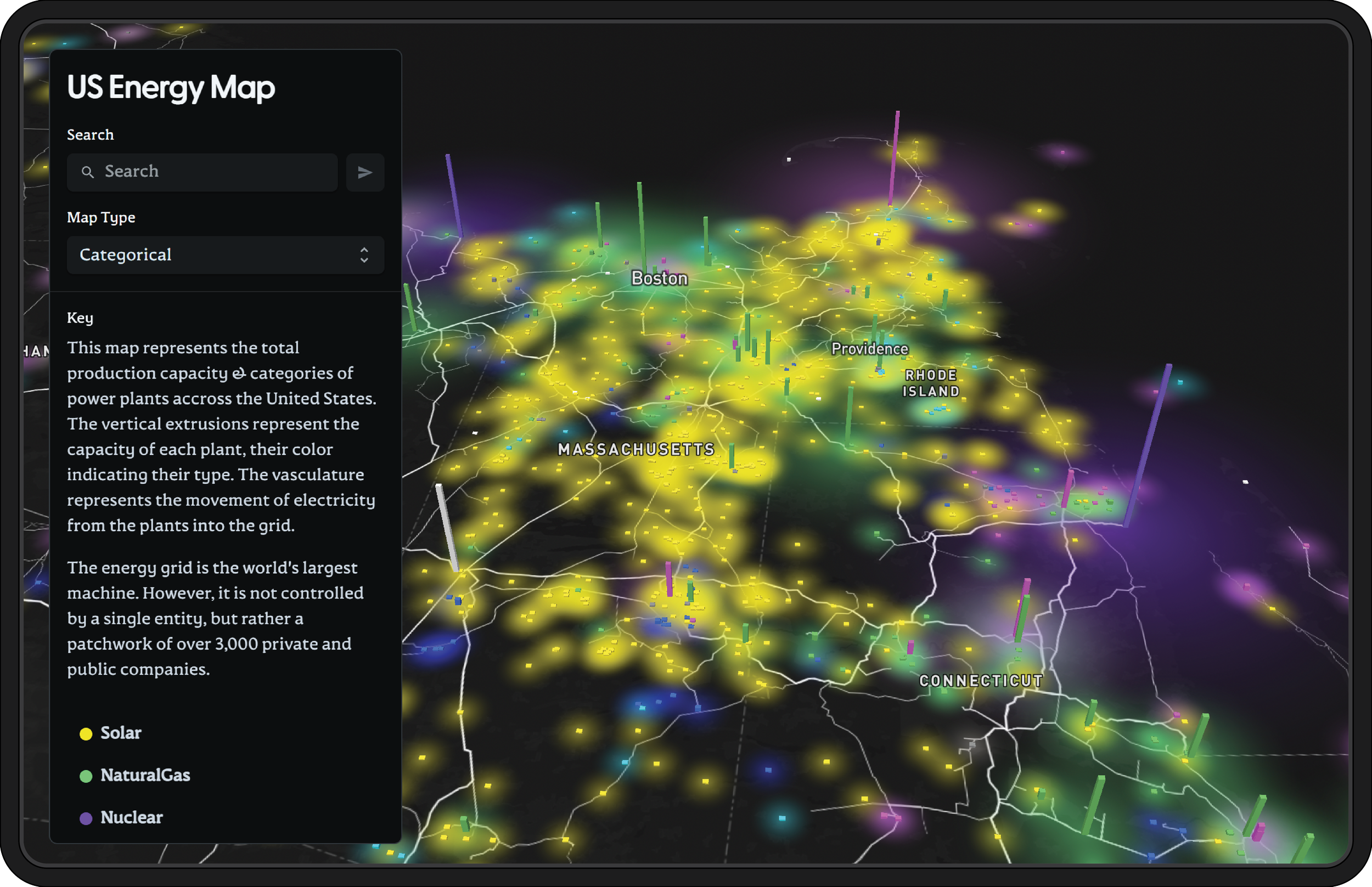

Show me a comparison of solar and nuclear in the Boston area.

The tool offers insight into the energy mix of a given area. The user can search for the location they are interested in, then isolate particular energy production methods. The vertical extrusions in the map represent power plants, with their height representing their annual capacity in megawatts. At this scale, we start to see that the area in which we live is powered by one fragment of a larger system. Within that particular fragment, we can visualize and understand the energy mix that supports our cities, neighborhoods, and homes.